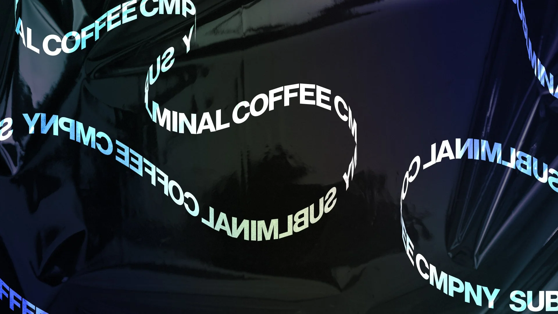
SUBLIMINAL COFFEE *
SUBLIMINAL COFFEE *
CASE STUDY
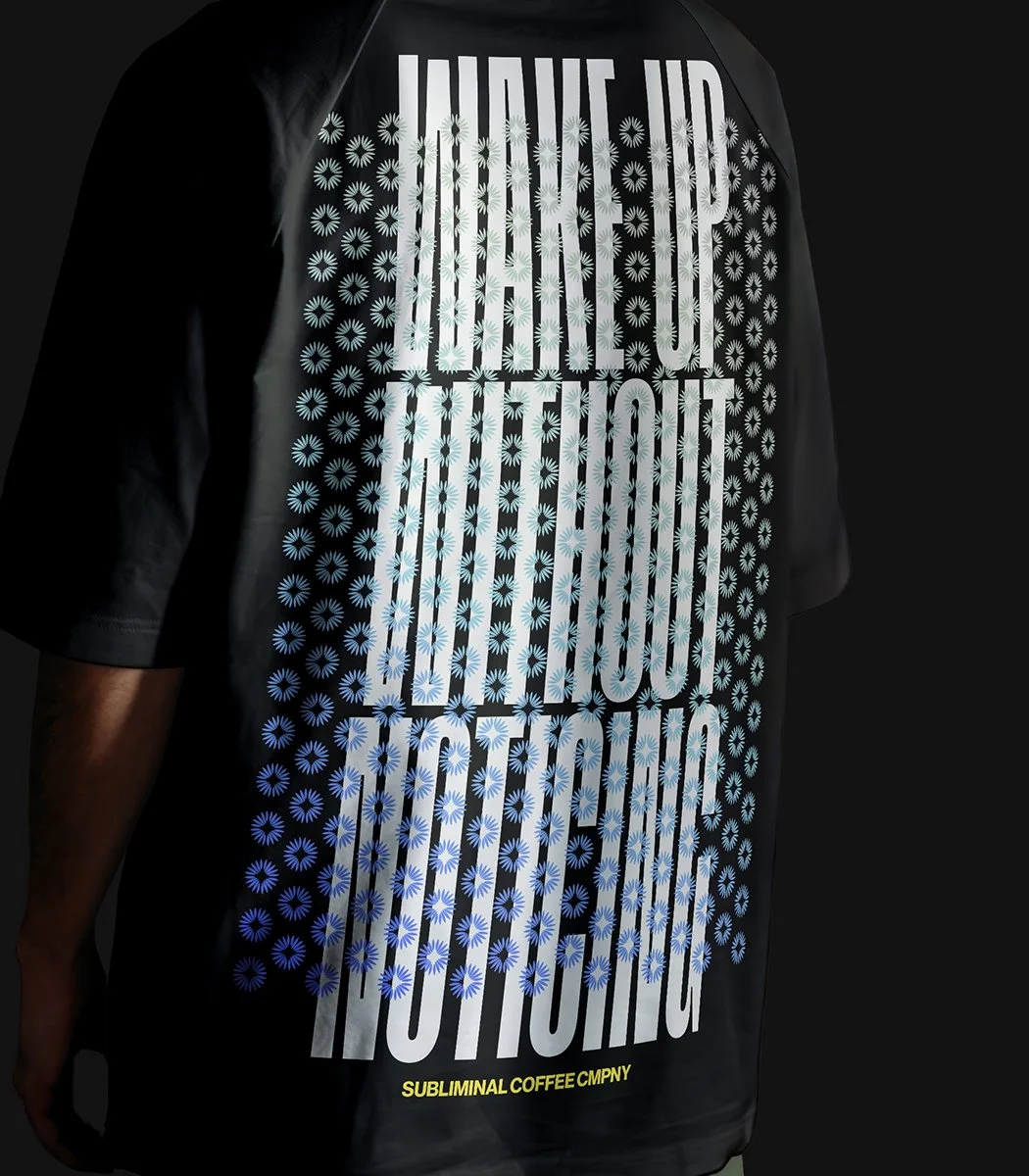
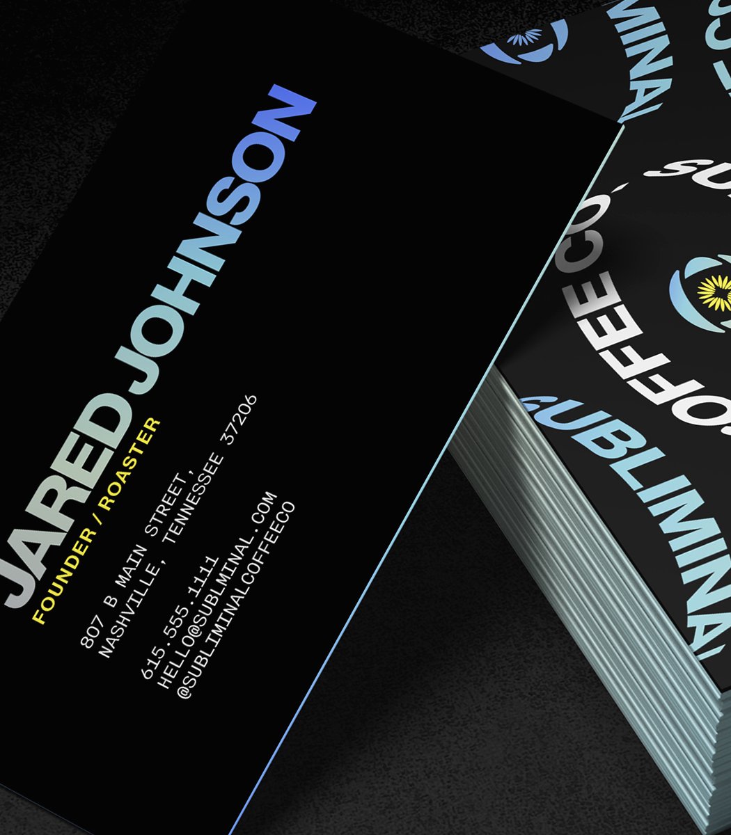
Branding Development, PackagingSubliminal Coffee started as a small Nashville coffee cart with a whimsical astronaut logo that symbolized exploration and growth. Building on that playful heritage, I reimagined the brand with a new logo — an eye-inspired symbol that hints at curiosity, awakening, and subtle discovery. The redesign expanded into a full visual identity, giving the brand a cohesive, memorable look that translates seamlessly across packaging, merchandise, and digital platforms.